Home
PROJECT 2
FRONT END APPLICATION UI
UX UI
UV Cyber
OVERVIEW
UV Cyber is seeking a responsive front-end web application with a unified UI, integrating data from three platforms to support strategic growth. This integration will result in a unified UI, marking a pivotal milestone for UV Cyber's strategic growth and market presence.
MY ROLE
  • Conducted user interviews with stakeholders and cybersecurity analysts and created personas.
  • Analyzed site map and user flows for v2, refining them for v3.
  • Led a workshop with stakeholders to prioritize v3 features and determine v2 exclusions.
  • Established a design system aligned with UV's branding.
  • Designed v3 UI and facilitated engineering handoff & support.
CLIENT
UV Cyber (formerly known as Achieve Cybersecurity)
TIMEFRAME
March 2023- December 2023
DELIVERABLE
Front End Responsive App
TEAM
Project Manager
Product Manager
Software Engineer
UX UI Designer
Director of Operations
Design Manager
Quality Automation Engineer
BACKGROUND
UV Cyber (UltraViolet Cyber) provides a comprehensive cybersecurity solution that combines defensive and offensive strategies seamlessly. The platform efficiently identifies and addresses critical risks and vulnerabilities through integrated red and blue-team activities, empowering organizations with proactive cyber readiness and resilience.
PROBLEM
Analysts and customers faced inefficiencies using three separate platforms for different functions. v2's partial integration lacked functionality and user-friendliness, necessitating a more seamless and unified solution.
SOLUTION
Through discovery and stakeholder negotiation, the proposed v3 of the UV Cyber platform optimizes and unifies features, allowing users to manage cybersecurity functions efficiently and respond proactively to threats.
GOALS
1
Responsive Design
Develop a responsive UI adaptable across devices.
2
Refined Workflow
Improve user experience by combining the best features and functionalities from the v2 version of the UV Cyber platform while eliminating ineffectiveness or complexities.
3
Scale and Evolve
Build a reusable design system with standardized components and design guidelines.
DEFINING THE MAP
Discovery
  • Conduct in-depth user interviews
  • Create customer and analyst personas
  • Develop primary customer user stories
  • Create site map for v2 and refine it into v3 to structure the platform’s organization
Synthesis
  • Create a cohesive UI
  • Implement a responsive design for seamless adaptability across devices
  • Develop reusable component library to ensure scalability and efficiency
  • Integrate features from v2 and optimize workflows
  • Gather feedback each sprint for iterative refinements
Hand-Off and Support
  • Facilitate a smooth hand-off from design to engineering
  • Provide clear documentation and specifications for designs and component library
  • Introducing engineers to Figma’s Dev Mode to increase efficient from design to code.
  • Offer ongoing design support during development and implementations.
QA
  • Provide post-launch support and maintenance to address any user feedback and ensure continuous improvements.
  • Conduct test and QA to identify and resolve potential issues.
  • Perform regression testing to ensure new features don’t negatively impact existing functionalities.
Discovery & Opportunity
UV CYBER V2 PLATFORM
Some of the pain points we discovered in the v2 of the UV Platform were:
  • Users navigated three separate platforms with different interfaces, leading to a disjointed and time-consuming workflow.
  • Visual and functional inconsistencies across platforms caused confusion with varying styles, icons, and navigation patterns.
  • The UI was not fully optimized for different devices, making it challenging to use on mobile or tablet devices.
  • Essential data and metrics were buried in complex menus or poorly designed dashboards, hindering quick access.
  • Lack of unified branding diluted the overall brand identity of UV Cyber.
  • The platform architecture and design were not scalable, making it difficult to add new features or integrate systems.
[Discovery & Opportunities Board]
ITERATION PROCESS
At the start of each iteration, we set clear objectives and goals for opportunities that addressed user pain points .  At the end of each iteration, we conducted a thorough review to assess the completed work and iterated based on feedback from the UV Cyber team.
Here were the opportunities for Improvements in v3:
THE MVP
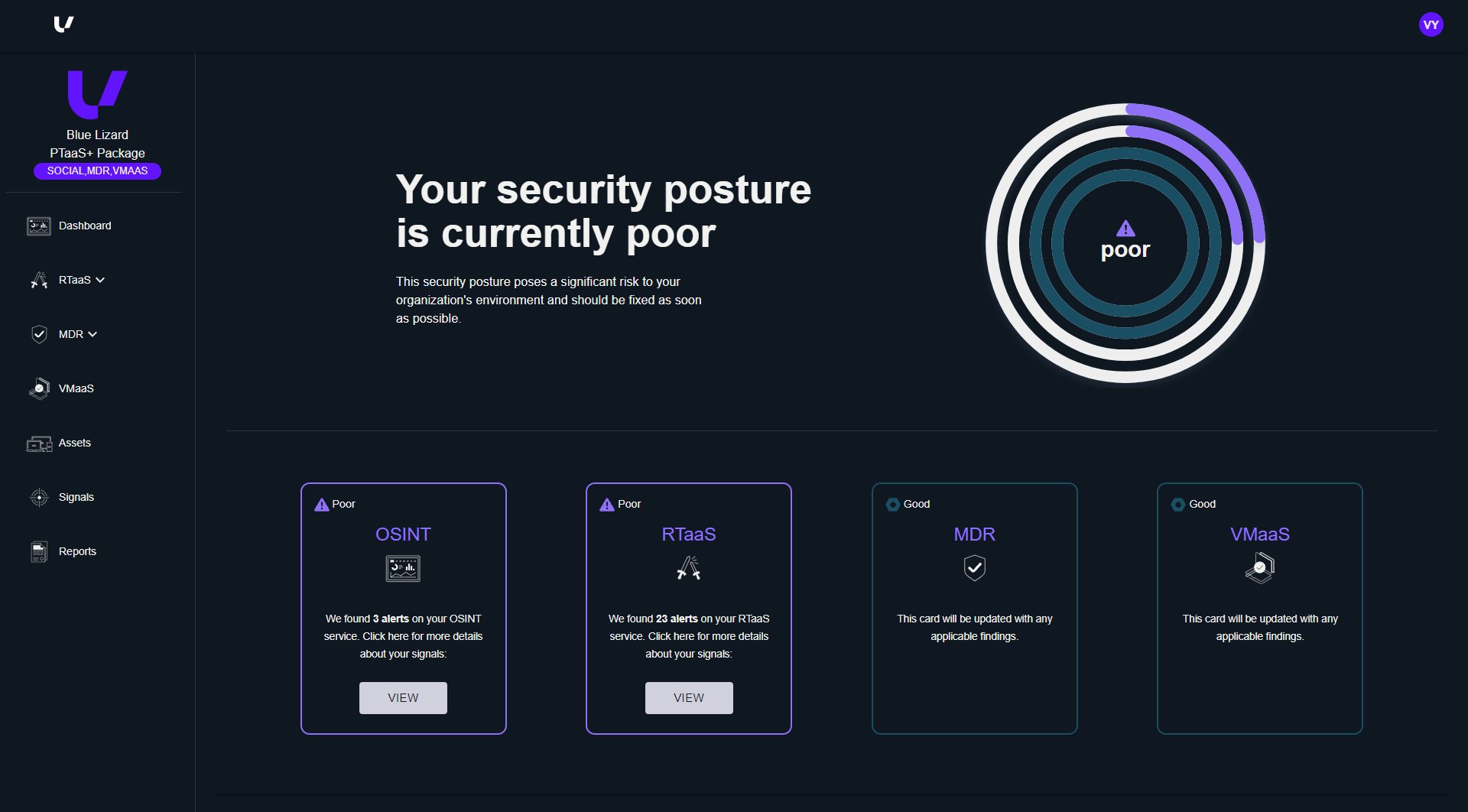
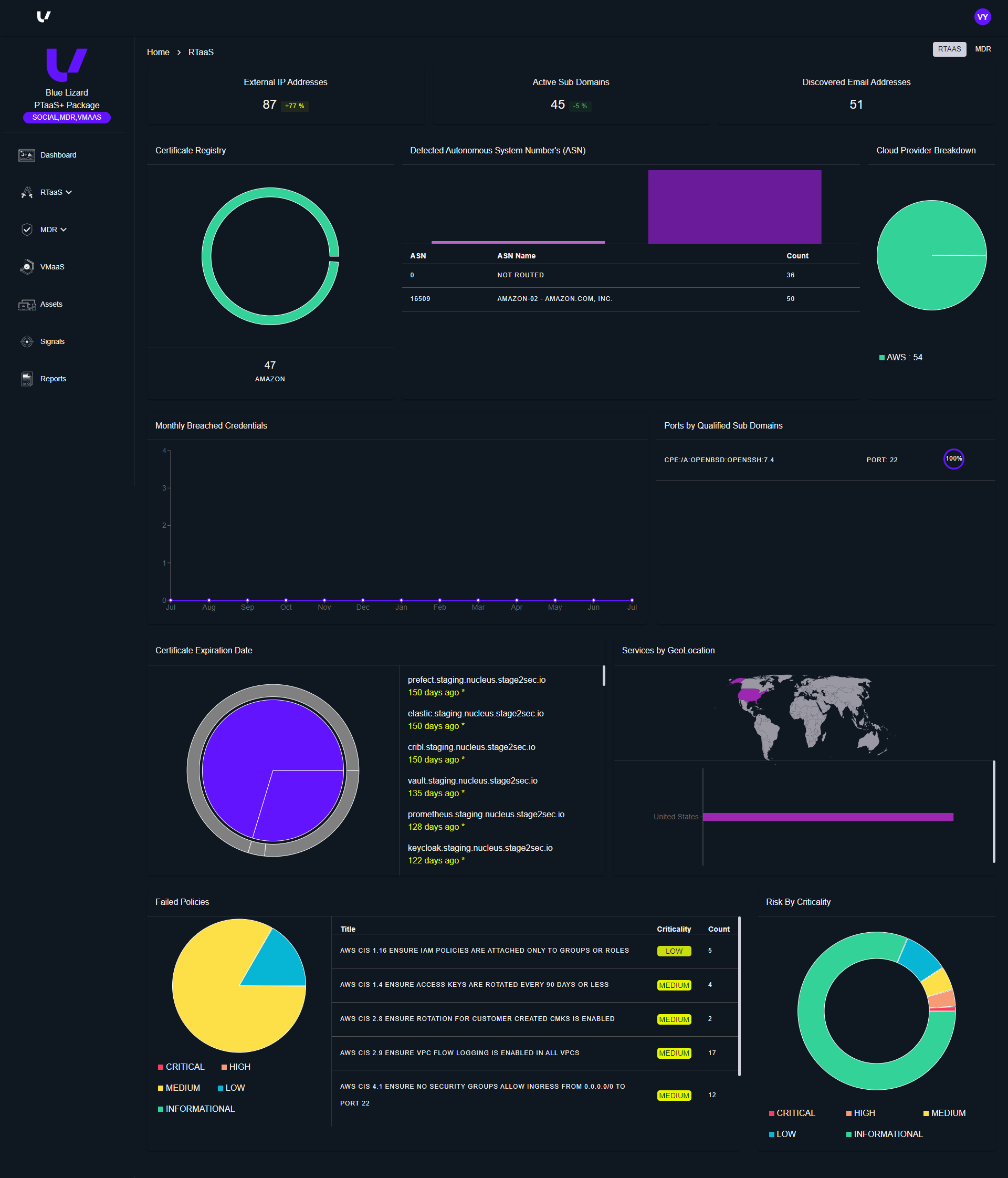
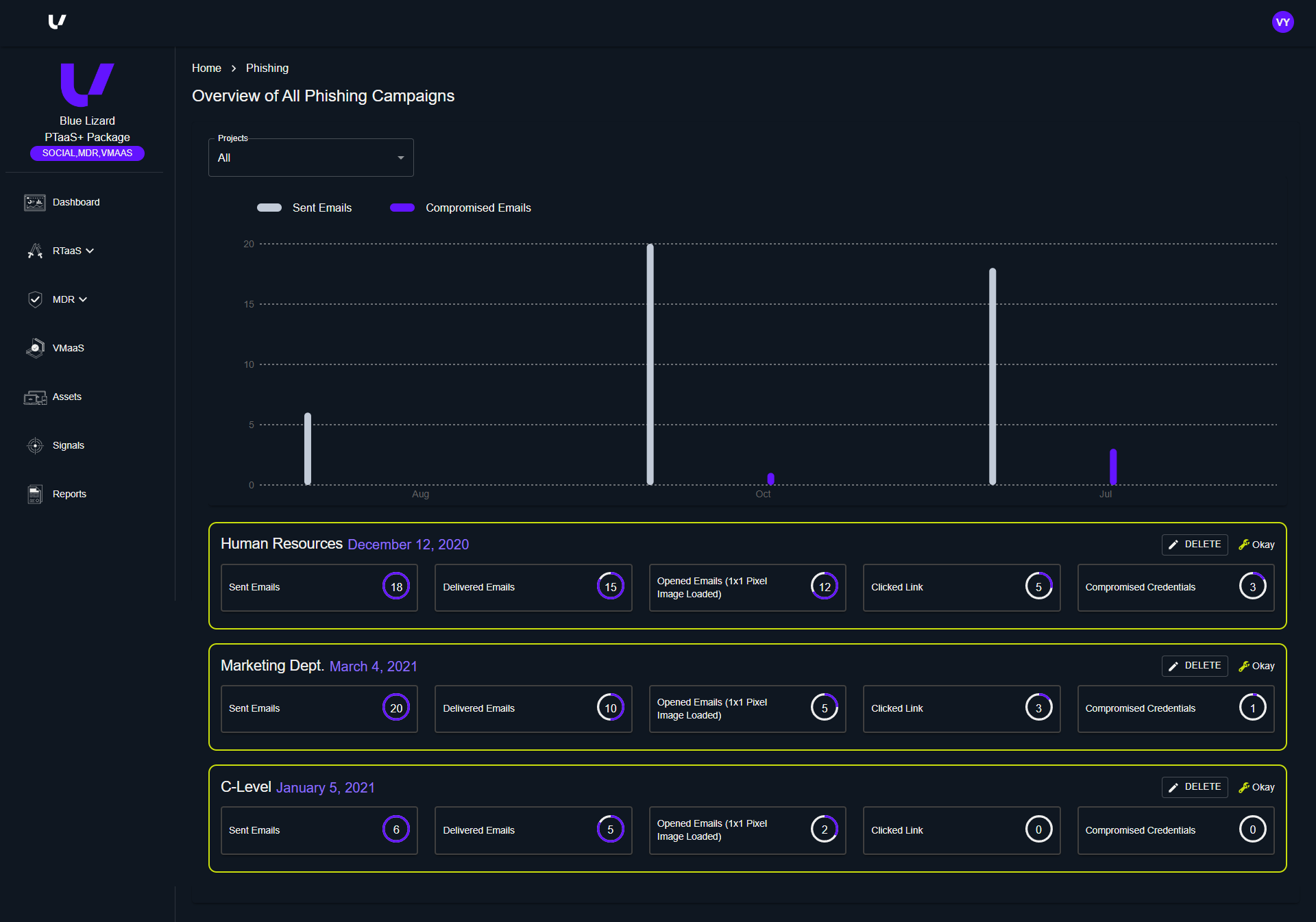
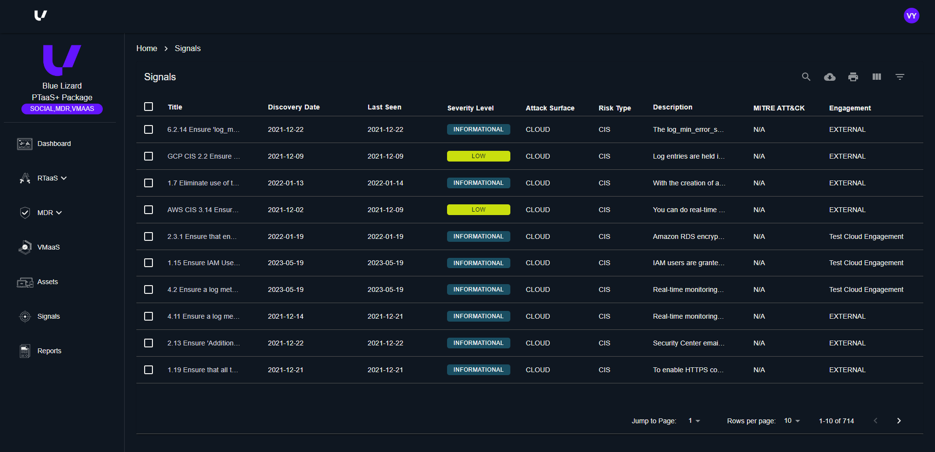
Using insights and knowledge gained from the discovery phase, we focused on designing five core pages each for Customers and Analysts, embodying these key design principles for v3:
1
Clear Navigation
4
Responsive Layouts for All Devices
2
Organized Information and Typography Hierarchy
5
Pleasing Visual and Branded  Design
3
Uniform UI Element
1
Clear Navigation
Implementing a navigation system that remains accessible and visible throughout the platform, with guidance to different sections.
2
Organized Information and Visual Hierarchy
Presenting information in well-organized grids and adopting a thoughtful typography & visual hierarchy to improve user comprehension.
3
Uniform UI Element
Incorporating distinct Calls-to-Action, uniform buttons, modals and pop-ups.
4
Responsive Layouts for All Devices
Created a responsive design, ensuring that the platform adapts seamlessly to various devices.
5
Visually Pleasing and Branded Visual Design
Created widgets and components for users to efficiently manage diverse cybersecurity functions.
THE MVP: Analyst and Customer View v3
Design System
Similarly to the Arkana Labs Project, I was responsible for creating the design system based on UV's existing branding. This design system included a comprehensive set of states for buttons, forms, navigation elements, and interactive components. I also defined color palettes, typography guidelines, and spacing rules to create a cohesive visual identity across the platform.
IMPACT & RECAP
The client describes the impact of our contribution, partnership, and innovation the best: Jake Groth, CTO of UV Cyber explains, “EIG's team was instrumental in transforming our user experience. Their innovative design approach not only accelerated our time to market but also gave us a competitive edge.”
Our collaboration resulted in a significantly improved platform that:
The v3 version of the UV Cyber platform is not only a testament to our design expertise but also a valuable tool that will empower UV Cyber to deliver exceptional service to their customers. (and even won a Netty Award for Best User Experience!)
Previous Project // [Arkana Labs]
Next Project // [SWISS Air]